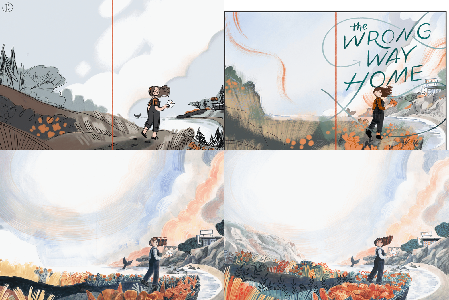
Wrong Way Home Book Cover
One way to make a book cover is to paint it twice!
Before I tell you about that though let me introduce the book. The Wrong Way Home is the story of young girl (Fern) who is taken by her mother from a compound where she has spent the last 6 years of her life in isolation with a commune of people. It’s a beautiful exploration of how difficult and emotional it can be to change your thinking when coming out of high control groups. I am truly honored to have been picked for this cover, Kate O’Shaughnessy is a wonderful writer and her book has rightfully earned awards! You can buy it wherever books are sold or please go request it from your local library!
I want to thank my editor Michelle Cunningham for all her guidance. She was a dream to work with! And thank you for Penguin Random House for trusting me with this piece.
Onward!
When I first started this cover the publisher had an idea for what they wanted but also asked that instead of just replicating their idea to also explore some new ideas and sketches.
Here are some of those first sketches I made for the cover. You can see the motel makes an appearance and then disappears in the next one. Though the motel is important to the story it was more of an ask but not a necessity.
I really like this one with all the trees. At this point Michelle had to pull me back to something more typical of a CA coast. You’d think growing up there I would have known right away what they were looking for but while I was thinking of my trips through Cambia, Moro Bay and San Francisco my editors were looking for something more beaches, cliffs and wild scrub brush focused. Unfortunately the pines had to go.
Here I am trying to sneak in more trees. And though I really liked this sketch it wasn’t feeling dynamic enough.
Here is where we start seeing where it’s going. Michelle requested more poppies and I’m glad she did! The publishers were also a bit nervous about the amount of color that was going to be in the final. To be fair this sketch is rather drab.
So I made this version to assuage any fears. You can tell Fern looks older than 12 here but this sketch is what I traced when making the finals. Just with edits to her face to make her look younger.
The publishers were still a smidge iffy about the amount of color and this is where I was having a bit of a hard time really explaining what the final would really look like. With digital work there is only so much I can do to show what the final will look like because my process of making a painting is so much about exploration and what looks right at the time. There’s a magic that comes from not overworking and the unexpectedness of leaving your process open for creative exploration. I expressed this to my editor and she was so kind and understanding and agreed that we shouldn’t put more time into working on the digital previews. Phew! It’s so nice to work with people who trust you to do your best!
But wanting to really hit those notes and expectations the publisher and my editor had was what ultimately what led me to paint two versions of the cover. The first one was not up to my standards so I made the hard choice to completely repaint it. And I’m so glad I did! There were things I liked and disliked about both versions and so I had the ability to pick and chose the parts I liked best.


